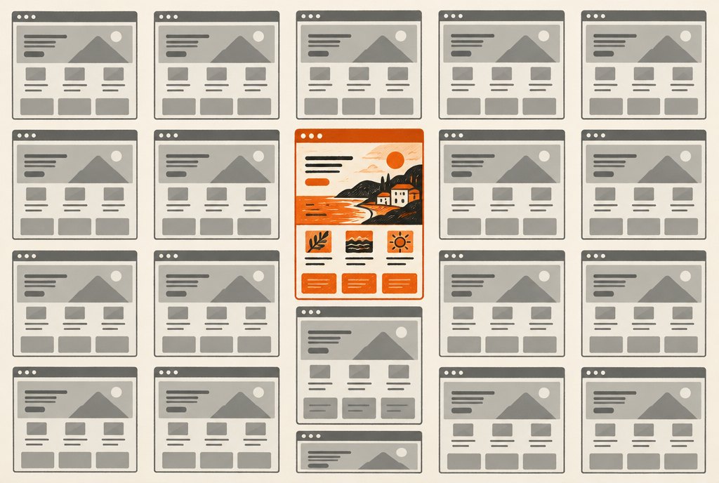
Ask three different AI builders for a plumber's website and you'll get the same site three times: a full-width hero with a stock photo, a headline that says "Reliable plumbing services you can trust," three icon cards, a testimonial slider, a footer. It's not that the tools are bad. It's that they're trained on the median website, and the median website is forgettable on purpose.
That's fine for a draft. It's a problem if it ships. So here's the pass I do on every AI draft before a client sees it. It takes about twenty minutes and it's most of what people are paying for.
1. Read the headline out loud to a stranger
If it could sit on a competitor's site without changing a word, it's filler. The fix is almost always to use something the owner already says. Northline's headline became "Plumbing done right, the first time" because that's how Dana answers the phone. The draft had "Your trusted local plumbing experts." One of those is a company; the other is a category.
2. Delete the three cards
The "Why choose us" row with three icons is the single most common AI tell. Nobody reads it. Replace it with one specific proof: a photo of the actual crew, a number only you could know, a sentence about the last job. Specificity is the entire game.
3. Pick one color from something real
Palette generators produce pleasant, interchangeable schemes. Take the color from the van, the sign, the packaging, the thing customers already recognize. Then commit to it: one accent, used for the one thing you want people to click.
4. Kill every sentence with "seamless," "elevate," or "solutions"
AI copy leans on a vocabulary that sounds confident and means nothing. Search the draft for the usual words and rewrite each sentence as if you were texting a customer. Shorter, plainer, more specific. If a sentence survives that test, keep it.
5. Check the photos for hands
Stock photography of hands doing generic work (typing, shaking, pointing at charts) is the visual equivalent of "solutions." Real photos of the business beat polished photos of a stranger's business every time, even when they're taken on a phone.
6. Make the one action obvious
Drafts tend to scatter buttons: "Learn more," "Get started," "Contact us," all competing. Decide what the site is for, make that button the only orange thing on the page, and repeat it down the page. Everything else becomes a text link.
AI gives you a credible site in an afternoon. The twenty minutes after that is where it becomes yours.
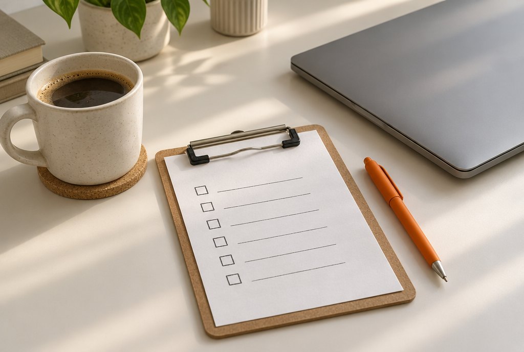
The checklist
- Headline: would a competitor ship it unchanged?
- Three-card row: gone, replaced with one real proof
- Accent color: from something physical the business owns
- Copy: no seamless, elevate, solutions, or leverage
- Photos: the real place and the real people
- One action, one button color, repeated
Run it on your own site this week. If more than three items fail, that's the afternoon to spend, and it'll do more than any redesign.